Convo
Overview
AP and the Convo app for DHIS2 allow for conversational analytics and visualizations for DHIS2. The web app offers a simple and clean interface for asking questions about your DHIS2 data in natural text.
The app will create meaningful data visualizations based on the user question and data response.
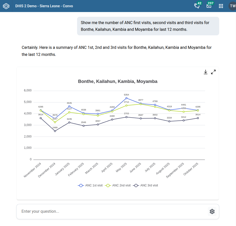
- For time series data, line charts will be created.
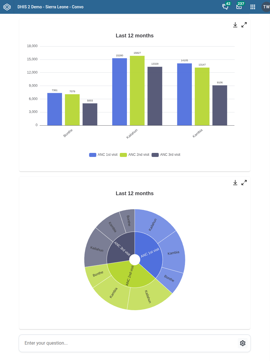
- For comparison of administrative and organizational units, column charts will be created.
- For categorical data, pie and sunburst charts will be created.
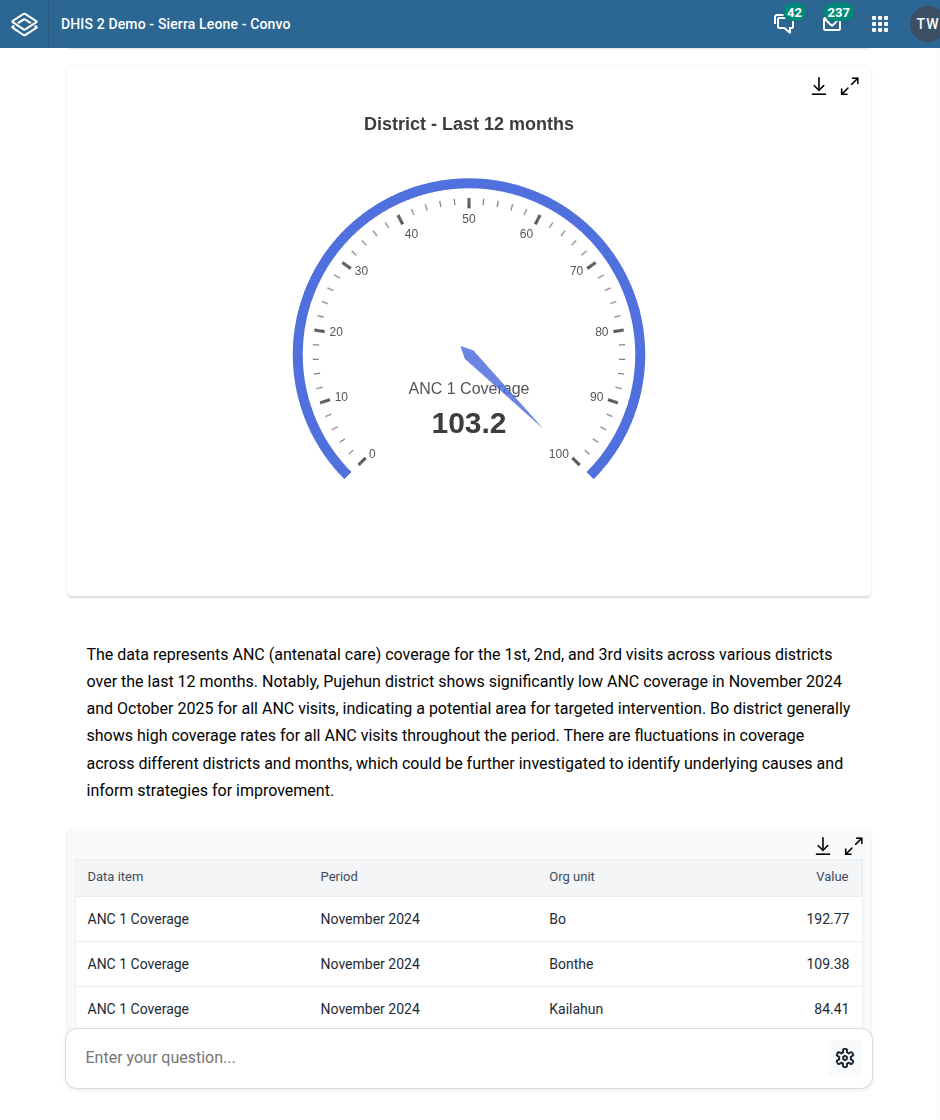
- For calculated data using percentages, gauge charts will be created.
The app will provide a range of output based on the user input.
- Charts
- Data table
- Interpretation
The Convo app offers a new take on data visualization. Creating a large number of visualizations and dashboards up front is tedious and often presents a challenge for users in finding relevant information. BI and data visualization tools are often complex and difficult to use for users without extensive training. With Convo, data visualization and tables are created instantly and on demand based on the user query.
Ask questions and get answers
To get answers, simply ask questions in natural text. Include relevant data items in the question.
To download a chart as a PNG image, click the download icon in the top-right corner of the visualization.
To view a chart in full-screen mode, click the expand icon in the top-right corner of the visualization.
To download a data table as a CSV file, click the download icon in the-right corner of the data table.
Data retrieval logic
The Convo app retrieves data using the following logic.
- Analyses the user natural text question and identifies DHIS2 dimensional metadata, such as indicators, time periods and org untis.
- Sorts data based on time period.
- Analyses the structure of the retrieved data and identifies relevant chart types.
- Retrieves data for relevant chart types using relevant dimensions and filters.
- Renders relevant charts.
- Creates a data text intepretation.
The app supports the following dimensional metadata.
- Data elements
- Indicators
- Program indicators
- Org units
- Org unit levels
- Fixed time periods
- Relative time periods
- Org unit group sets